Modeler Overview
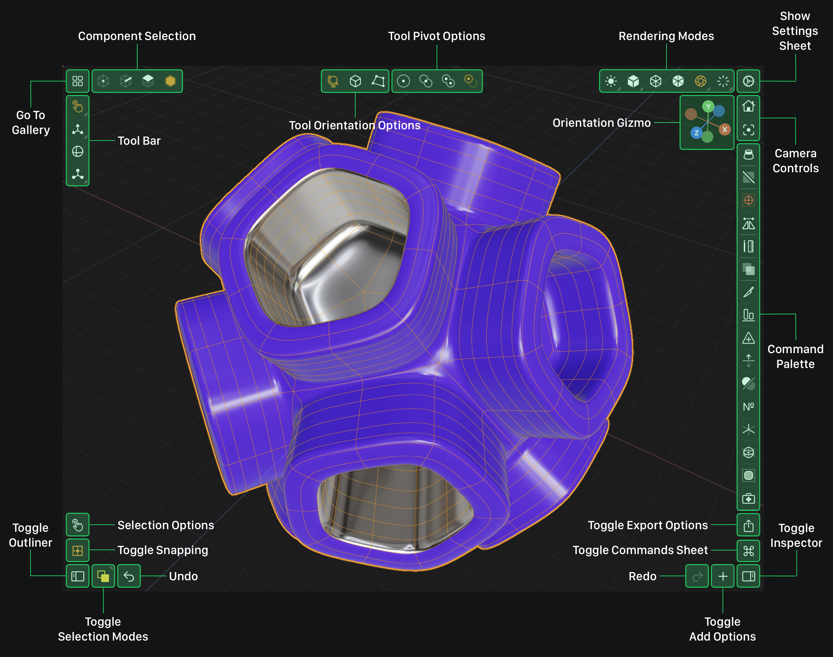
Valence 3D's modeling interface (Modeler) is designed around the principles of contextual awareness, progressive disclosure and minimalism. By default the user interface shows only the most essential and commonly used items. These items are highlighted below in green. Other tools, options, commands, and preferences show up when needed via sheets, sidebar panels, 3D UI elements, etc.
Modeler Interface

The Modeler section of this manual will describe in detail each one of the sections highlighted and labeled in the Modeler Interface image above. The sections below describe the three key principles used to design the interface.
Contextual Awareness
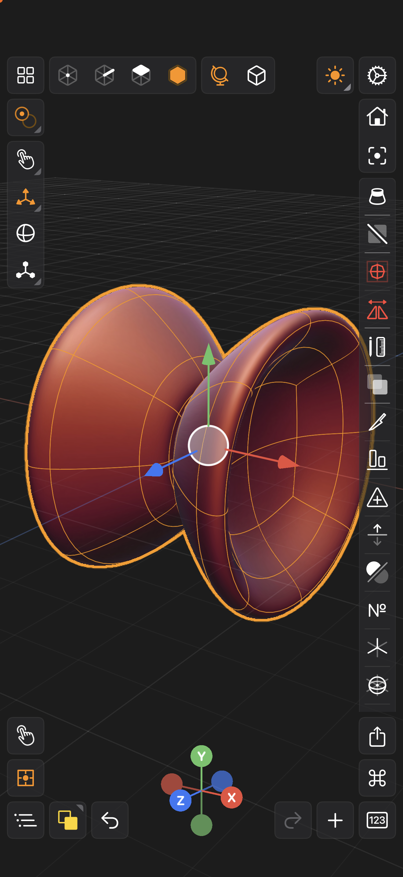
Whenever you interact with Valence 3D's Modeler view, its interface changes based on your interaction and the current selection.
For example, if you have nothing selected and you tap on a mesh in your scene, then the Command Palette on the right edge of the screen will populate with node & mesh commands you can perform. If you deselect that mesh, i.e. by tapping elsewhere on screen, then those contextual commands disappear until you select another mesh.
Progressive Disclosure
Valence 3D's Modeler view gradually exposes contextually aware options as you perform actions (selecting, deselecting, changing component selection modes, etc). This reduces cognitive overload and allows you to learn parts of its interface as you need them.
For example, when you want to export your work, you can tap on the Toggle Export Options button on the bottom right, and the interface will present the Export Options modal sheet with various export types. By tapping on an export type, another sheet will pop up and show customization options for the export type you selected.
Minimalism
Valence 3D's interface is designed to encourage play and induce flow while creating. It does this by hiding high frequency user interface items, such as buttom labels. Labels are very helpful for initially learning an interface, however on tablets and phones these labels take precious space and reduce much needed area for viewing, interacting, manipulating, etc.
Valence 3D's Modeler interface embraces minimalism by stripping off all the labels of the buttons. At first this might seem counter intuitive, but if you tap and hold on any button, a temporary Tutorial indicator will show the label of the button (and sometimes a description of how to use that button's action or mode). Moreover, this user manual and various YouTube tutorials are meant to help you learn the actual actions of each of these buttons.
iPhone vs iPad
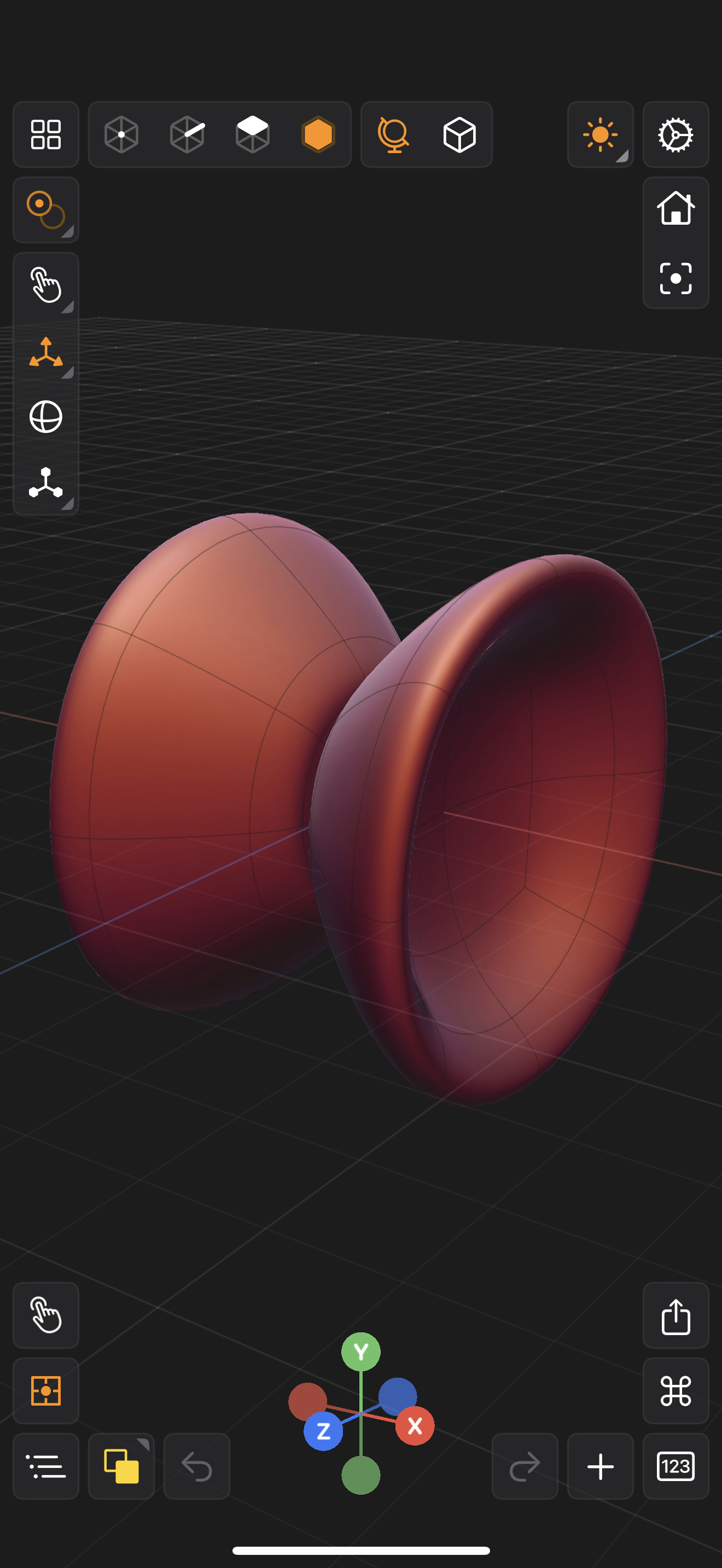
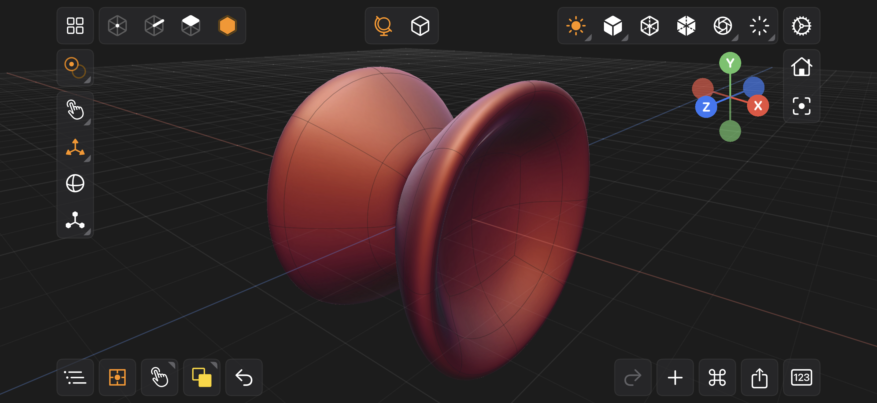
Valence 3D's Modeler interface on iPhone is very similar to its iPad counterpart. When on iPhone, the modeling interface utilizes small modal overlays to present various sub-options. For example, on iPhone to select a Rendering Modes, you first tap on the Rendering Mode button, then a modal overlay appears that shows different rendering modes. Then you simply tap one of the rendering modes and the rendering mode button will show the mode you have selected. You can move the camera to make any of the modal overlay menus disappear.
One other major difference between the iPhone modeling interface and the iPad's is that the Inspector and Outliner use sheets instead of sidebar panels.
When you see a small triangular shape inside of a button, it indicates that the button will either show a modal overlay with options to select from or that it will expose preferences for that item if its already selected and tapped again. See below.
For example, if you tap on the move tool twice, a modal sheet will popup showing preferences for the move tool. On iPhone, there are modal overlay options for Selection Modes, Rendering Modes, Tool Orientation & Pivot Options and Tools.


